Friday, May 23, 2014

House Before & After Series: Living room

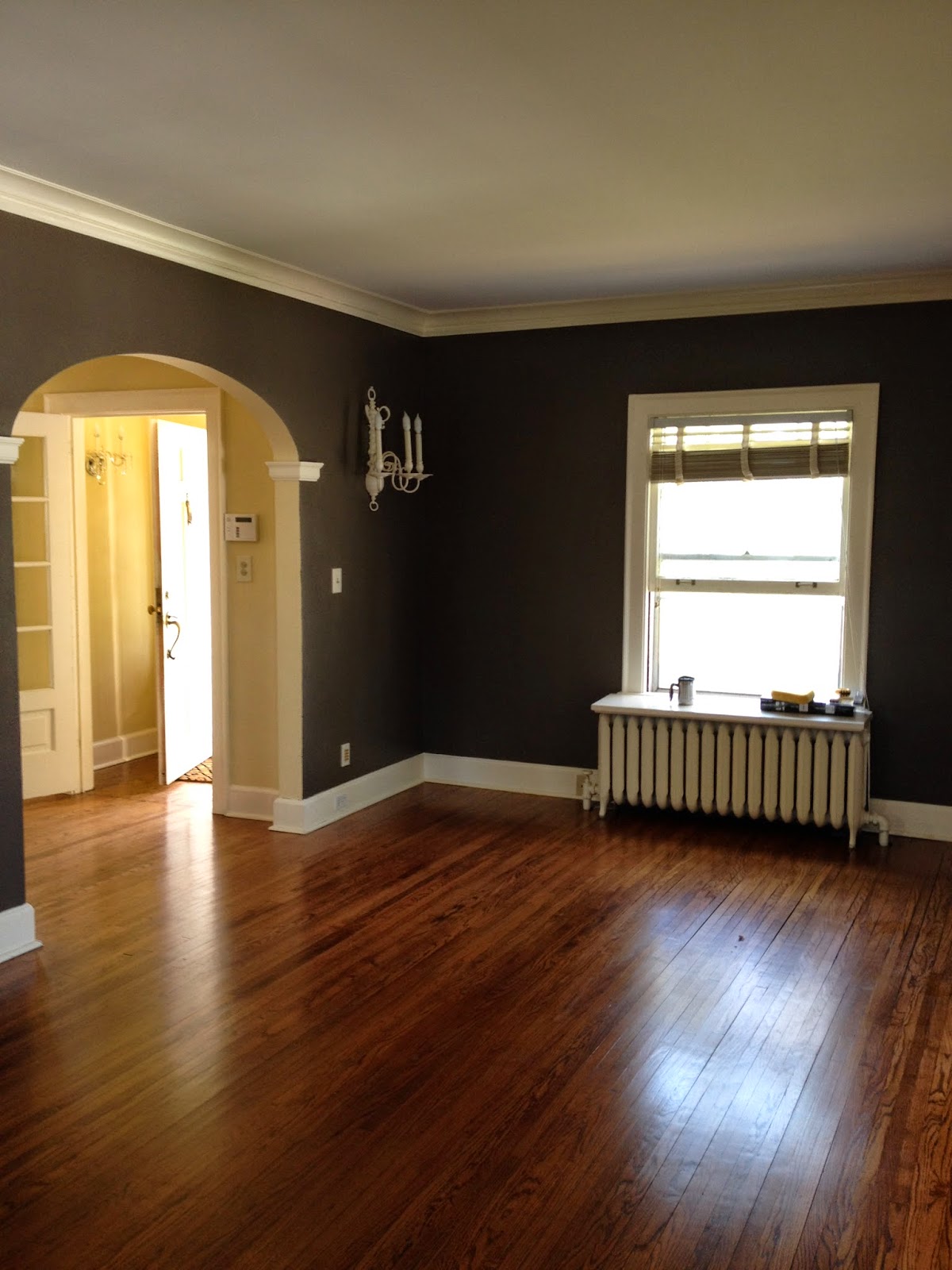
We started our house updates with the living room. We ordered new furniture so we wanted to get the room painted before the furniture was delivered. The living room is a perfect size with the wood burning fireplace as the focal point. We love the built ins! We wanted extra seating so we decided a sectional would be best. The only place to hang the TV was above the fireplace due to a radiator on the other wall. That meant the huge mirror had to come down.

Here is the living room before we started:


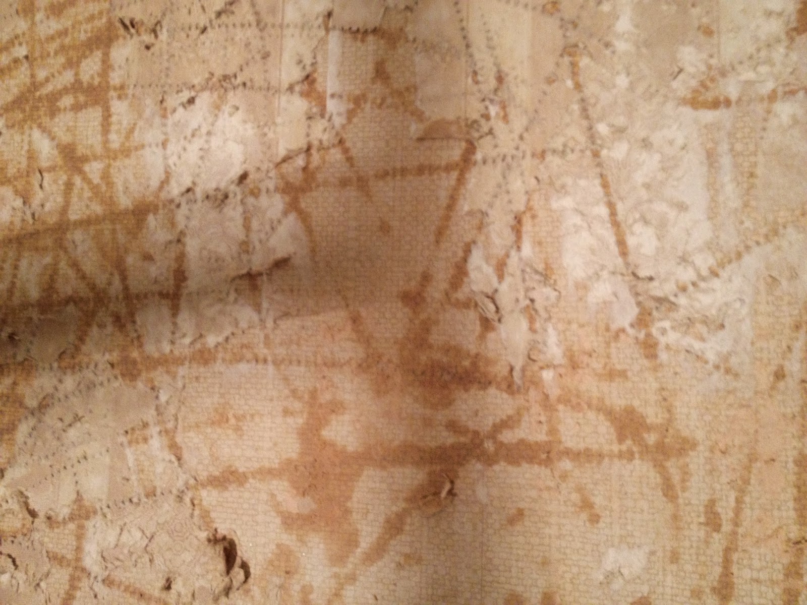
Our project started with removing the mirror. What we found behind it wasn't pretty. It was easy to remove from the wall, but it was extremely heavy. D and I had to very carefully lower it from the mantle and carry it out to the garage without it shattering. We did that successfully (we only broke a little piece off the edge- whoops!) and found this behind the mirror:


Layers and layers of super old wallpaper along with 2 giant holes that were stuffed with newspaper. I guess no one prior to us ever had a TV in this living room. So no need to remove the mirror until now. We pulled out the newspaper to find it was from 1941! How crazy. One of the articles was about a vitamin that would turn gray hair back to it's natural color. Ha!


We found some old electrical wiring in the holes and couldn't figure out what the heck they were for! I was worried that this was going to be a big expensive problem. After a trip to home depot and a conversation with a super helpful lady, we found out there was once sconces where there are now holes. She helped us plan how to cover the holes and remove the wallpaper and gave us everything we needed. We then talked to a guy in the electrical department that helped us figure out if the wiring was safe to cover  We used a wire tester to see if the wires were hot and luckily they weren't so were able to cover them up. The best home depot experience I have ever had. Nothing better than excellent customer service.


 We started by removing the wallpaper. D used a scoring tool to score the wallpaper so the water could penetrate it easier. The lady at home depot recommended using fabric softener to remove the wallpaper, so we mixed a cap full of softener into a 5 gallon bucket of warm water. D then sponged on the solution and scraped the wallpaper off with a metal scraper. We were up until 2:30 am that night (friday- the day we closed!) removing the wallpaper. Our furniture was scheduled to be delivered on sunday, so we had to get the walls painted.


D did such an awesome job cleaning up the wall. I was priming the bedroom while he scraped and periodically sweeping up for him. I would recommend that every homeowner has some kind of wet/dry vacuum or shop vac. We ordered this Stanley vacuum before moving in and it was one of the best purchases we made. Cleaning up was so easy! He stripped and cleaned the wall down to the plaster and we used drywall tape, a metal scraper and all purpose spackling to cover up the holes. When the spackling was dry the next day, I smoothed it out with a final layer and let that dry. I sanded it smooth and used Kilz primer to seal the wall.


We started painting the living room by first painting the edges and near the trim with a brush to make rolling the rest of the wall pretty easy. I should also mention I washed the walls with TSP the night before to make sure the walls were clean so the paint would adhere well. I painted the edges carefully and D rolled on the paint. The color we chose is a dark warm gray color. I thought it would look great against the white trim and warm wood floors.


I am so glad I eat a lot of Talenti because the containers are perfect for painting! I poured some in the jars and used that to paint the trim. So easy! It is great for storing touch up paint too because it has a nice screw on lid. 


One wall was done with the first coat and it looked pretty great! We used Sherwin Williams super paint in satin finish, which is a paint and primer in one. It went on really smooth and coverage was pretty good.  


I had to remove the brass wall sconce so I could paint. I was originally putting this thing on craigslist, but I figured I would try spray painting it first. Here is the before:


After a few light coats of spray paint, I loved it! It turned out so well! I used an ivory spray paint that matched the trim color. It really pops off the gray walls. I love it because it stays true to the old charm of the house but the white color makes it more modern. 


Once the first coat of paint was dry, D and I quickly went over the walls and edges with a second coat and focused on the areas that really needed it (where the lighter color was showing through). This paint had pretty great coverage so a full second coat wasn't needed. Here are the completed pictures:


What do you think? I love it! I will update soon with everything moved in.

UPDATE: I finally got around to taking some pictures this past weekend. We are all settled in and loving it!


Wednesday, May 21, 2014

Home design plan


I can't wait to really put our personal touches on this house. We have been picking out paint colors, decor, and furniture since we saw the house and it's a good thing everything went smoothly or we would have been crushed. We are fortunate to have had a great realtor to work with who made the process easier. 

D was getting pretty fed up with me since I had at least a package or 2 delivered about every other day. What's a girl supposed to do when she is anxiously awaiting the most exciting and biggest investment in her entire life? Shop online of course! Most of the things were from Target (that discount makes it easy to spend all of my money there!). I also spent hours and hours on pinterest collecting images and ideas so I could find just the right inspiration to convey the look I wanted.

Overall, I'd say the design plans for the house are casual. I hate to say modern or traditional, because my taste is more modern and D's taste is more traditional. I think we have found ways to strike a balance so we are both happy. We love the colonial charm of the house, so we definitely want to stay true to that but update it with a fresh look. We've picked a pretty cool neutral palette, focused around hues of blue and earthy tones. I think this will tie the rooms together well even though they have their own design aesthetics. 

Here is a breakdown of our design plans for the house:


The house has a stucco exterior that is currently painted a creamy ivory color. We have tossed around the idea of painting it gray in the future, but for now we are going to work with what we've got. We plan to paint the shutters black and paint the front door a nice and bright fire engine red. Something about a red front door just says "home" to me. It has a very cheerful, welcoming feeling and makes a bold statement. 


We plan to remove the giant mirror above the fireplace and mount our TV so that we can make this a very causal, usable space. D and I watch a lot of TV so this is where we spend a lot of time. We want to make sure it's nice and cozy. Have to have a great spot to watch Game of Thrones, True Blood, Nashville and Late Night with Jimmy Fallon. An interesting mix of shows, I know. We ordered the sand colored sectional from HOM furniture. It's microfiber, so it will hold up well with our cats and is easy to clean. It's actually nearly the exact style of our current couch, so we know it will be very comfy. We picked a warm gray tone for the walls to make it nice and inviting. There's plenty of windows so I think they will contrast nicely with the darker color of the walls. I plan to keep the living room mostly neutral with teal accents. 


Something about a deep teal spoke to me for the dining room. It took a lot of convincing for D to give me the go-ahead, but I'm really excited about this one. I think you have to take some risks somewhere in your home, and the dining room is where I want to do it. I have these great Tracey Reese plates that she designed for the Neiman Marcus collection for Target that I plan to hang on the wall. I also got an awesome Queen Anne style dining table from our neighbor who was moving out and no longer wanted it. It's in pretty rough shape, but I am going to work my magic. That will be another blog post :)


The kitchen in this house is pretty awesome. Pretty white cabinets paired with butcher block countertops and a white country sink. Score. The downfall of this kitchen however is the disgusting wall texture. It looks like someone smeared peanut butter all over the walls. So that will be a fun project and first for me- skim coating. But then I'm going to paint my walls the prettiest shade of blue that will coordinate with the Ice Blue Kitchen Aid mixer that we have on our wedding registry.


Ahh the bathroom. The problem child of this house. It's the one room that really needs work. In the short run, I may paint the walls a soft muted teal and paint over the pink tiles with the special tile epoxy paint so they are a fresh white. In the long run, we will be replacing the flooring with wood look porcelain tile and using subway tiles to retile our shower. That is for the future though.


And finally, for our master bedroom we are going to lighten it up. It's currently painted a deep, mauvy
purple that is not my taste. It feels very drab and makes the room seem small. I chose a nice calming blue color. I am going to make an upholstered white headboard for our new king size Ikea bed and give the room a nice earthy feel with natural colors. We will be spending a lot of money at Ikea for this one. 

I am so excited to get a start on these projects. Before and after pictures are my absolute favorite!!!

Tuesday, May 20, 2014

Our 1923 Colonial

We knew the moment we saw the images online that this was the one. When we walked in, it felt like home. It has everything on our wish list- sun room, wood floors, nice kitchen, wood burning fireplace, and lots and lots of charm. The location is great too- just North of downtown Minneapolis in Theodore Wirth Park. Thats right, I said IN a park! How much better can it get? Our front yard is actually part of the park. And we are steps away from a beautiful bike trail and a short distance from a lake. Dream come true.

All of these pictures are from the MLS listing.

Front of the house:
View of the yard:
Entry:
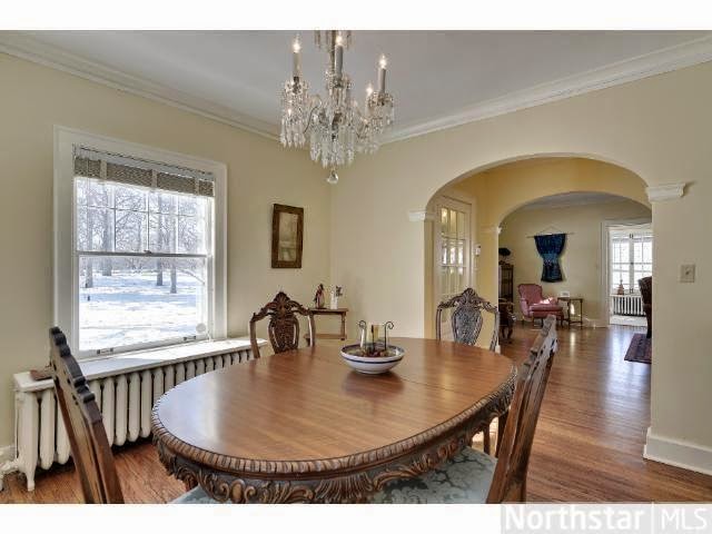
Dining room:
Kitchen:
Living room:
Sun room
Upstairs full bathroom:
First bedroom:
Second bedroom:
Master bedroom:
Yard and garage: